
In the world of branding and design, color plays a pivotal role in shaping a brand’s identity and communicating its values. The selection of the right color palette is not a random choice; it’s a strategic decision that involves understanding color psychology, considering the target audience, and aligning with the brand’s core values. In this article, we will delve into the significance of color in branding and provide insights on how to choose the ideal color scheme for your brand.
The psychology of color in branding
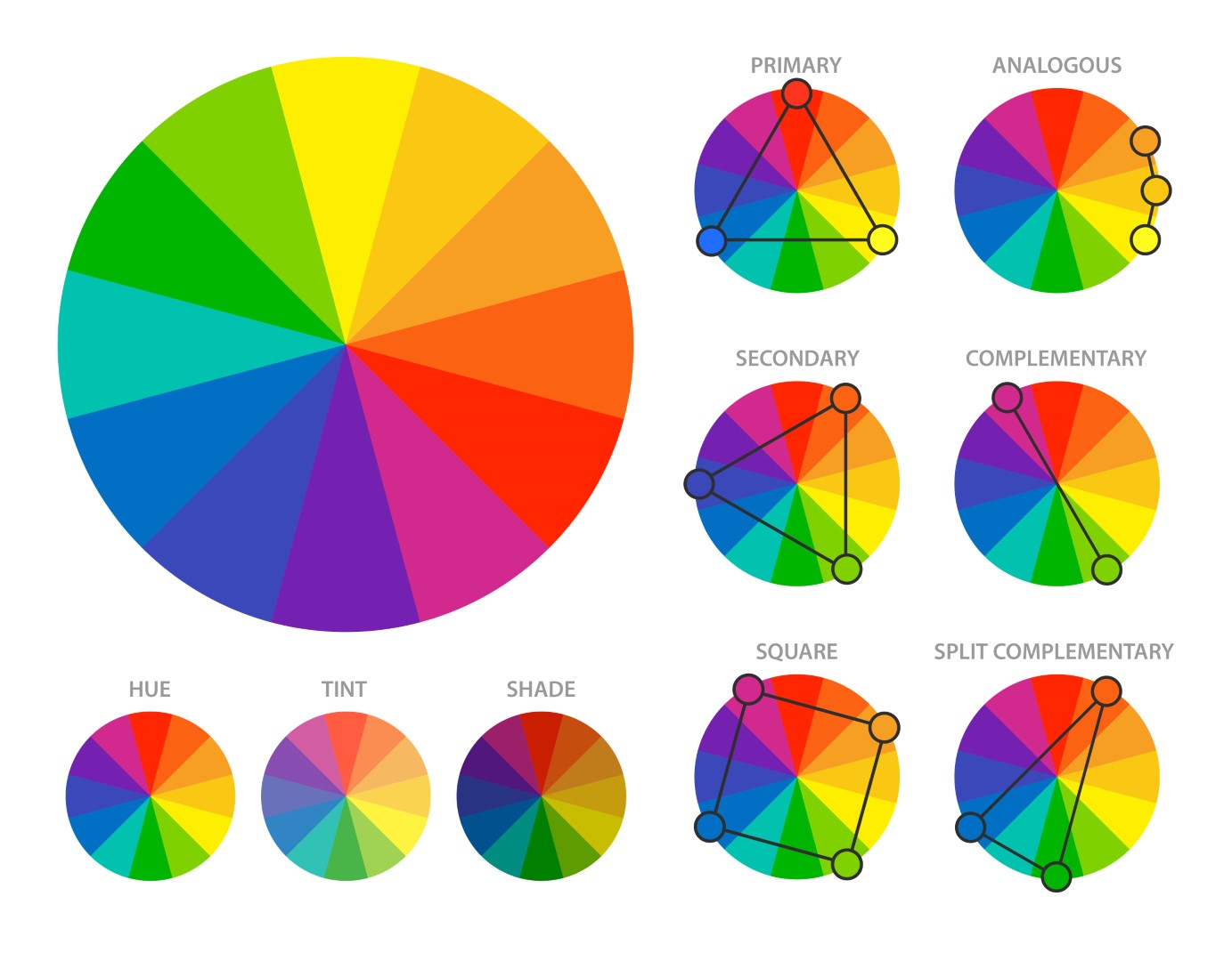
Color is a powerful visual tool that evokes emotions, conveys messages, and triggers associations. In branding, understanding the psychology of color is crucial, as it can influence how consumers perceive and interact with a brand. Here’s a glimpse into the emotions and associations commonly associated with different colors:
| Color | Emotions | Associations |
|---|---|---|
 | Passion, excitement, energy, love | Boldness, action, energy |
 | Calmness, trust, serenity | Trustworthiness, authority, loyalty |
 | Nature, growth, freshness | Health, sustainability, wealth |
 | Happiness, optimism, warmth | Creativity, energy, positivity |
 | Royalty, creativity, spirituality | Luxury, imagination, uniqueness |
 | Enthusiasm, vibrancy, fun | Creativity, energy, affordability |
 | Romance, sweetness, youthfulness | Love, femininity, playfulness |
 | Earthiness, durability, reliability | Simplicity, authenticity, tradition |
 | Elegance, sophistication, mystery | Luxury, formality, power |
 | Purity, simplicity, cleanliness | Minimalism, clarity, neutrality |
 | Balance, neutrality, practicality | Timelessness, professionalism, conservatism |
Understanding the emotions and associations linked to colors is just the beginning. The real challenge is to align these psychological elements with your brand’s identity, values, and message.
Factors to consider when choosing a color palette
Selecting the ideal color palette for your brand involves a comprehensive evaluation of several factors:
- Brand personality: Define your brand’s personality. Is it energetic or calm, youthful or mature, playful or serious? Your color choices should align with this personality.
- Target audience: Consider your target audience’s preferences and cultural background. Different demographics may have varying color associations and preferences.
- Competitive landscape: Analyze the color palettes of your competitors. You want your brand to stand out while still fitting within the industry’s norms.
- Color combinations: Explore how different colors work together. A primary color should dominate, while secondary and accent colors provide contrast and depth.
- Usability: Think about where and how your colors will be used. They should be versatile enough for digital and print applications.
- Accessibility: Ensure that your color choices meet accessibility standards, making your brand inclusive to all.
- Longevity: Consider the long-term relevance of your color palette. You don’t want to rebrand frequently due to outdated colors.
Real-world examples
Let’s look at a few examples of well-known brands and their color choices:
Facebook’s blue color choice reflects trust and reliability, reinforcing its commitment to a safe and secure online platform.

Starbucks
Starbucks incorporates green into its logo to symbolize freshness, growth, and the brand’s connection to nature and sustainability.
McDonald’s
McDonald’s famous golden arches are synonymous with happiness and affordability, making it inviting and appealing.

Coca-Cola:
Coca-Cola’s bold use of red communicates excitement and passion. It aligns with the brand’s energetic and optimistic image.
The art of combining colors
Creating a cohesive color palette involves selecting primary, secondary, and accent colors that work harmoniously. Here’s a typical approach:
- Primary color: The dominant color representing your brand’s core values and personality.
- Secondary colors: Complement the primary color and add depth to your brand’s visual identity.
- Accent colors: Used sparingly to draw attention to specific elements like call-to-action buttons or highlights.
Remember that consistency is key. Once you’ve chosen your colors, use them consistently across all brand materials, including logos, websites, packaging, and marketing materials.
Testing and feedback
Before finalizing your color palette, gather feedback from your target audience. Conduct surveys or focus groups to assess their emotional responses to your chosen colors. Their input can provide valuable insights and help you fine-tune your color choices.
Conclusion
Choosing the right color palette for your brand identity is a strategic decision that goes beyond aesthetics. It involves a deep understanding of color psychology, alignment with your brand’s personality, and consideration of your target audience’s preferences. When executed thoughtfully, your brand’s colors, can become a powerful tool for conveying your message, building trust, and fostering lasting connections with your audience.
In a world saturated with visual information, the colors you choose, guided by Koloursyncc’s branding expertise, have the potential to make your brand memorable and impactful, setting you apart in a crowded marketplace.
Koloursyncc helps you harness the psychology of color to create a brand identity that resonates with your audience and leaves a lasting impression.