
In today’s digital age, the majority of internet users access websites and online content via mobile devices such as smartphones and tablets. Therefore, ensuring that your website is mobile-friendly is no longer an option—it’s a necessity. Mobile-friendliness not only enhances user experience but also impacts your search engine rankings. In this guide, we’ll explore the best practices for creating mobile-friendly websites in 2023.
Understanding the importance of mobile-friendliness
Before diving into the best practices, it’s essential to understand why mobile-friendliness is crucial.
- Enhanced user experience: Users expect a seamless experience regardless of the device they’re using. A mobile-friendly site ensures that visitors can navigate, read, and interact with your content effortlessly on their mobile devices.
- Search engine optimization (SEO): Search engines like Google prioritize mobile-friendly websites in their rankings. Non-mobile-friendly sites may see a drop in search engine visibility, which can negatively impact organic traffic.
- Increased mobile usage: The number of mobile internet users continues to rise. To reach a broader audience, your website must cater to mobile users effectively.
Best practices for mobile-friendly web development
- Responsive design: Implement responsive web design principles to ensure that your site adapts to various screen sizes and orientations. This eliminates the need for separate mobile and desktop versions. Responsive design not only enhances the user experience but also simplifies website maintenance, as you only need to update content once for all devices.
- Optimize page speed: Mobile users have limited patience for slow-loading pages. Optimize images, minify code, and leverage browser caching to improve page speed. Consider using Content Delivery Networks (CDNs) to deliver content from servers closer to the user’s location, further reducing load times.
- Mobile-friendly navigation: Design intuitive and user-friendly navigation menus for mobile devices. Consider using a “hamburger” menu (a collapsible menu represented by three horizontal lines) or sticky navigation (a menu that remains visible at the top or bottom of the screen) for better accessibility. A clear and straightforward navigation system is essential for guiding users on smaller screens.
- Readable font sizes: Use legible font sizes and maintain proper line spacing to enhance readability on smaller screens. Avoid tiny text that requires zooming. The readability of your content directly impacts the user experience. Make sure fonts are easily readable without straining the eyes.
- Thumb-friendly buttons: Ensure that interactive elements like buttons and links are large enough to tap with a thumb comfortably. Adequate spacing between elements prevents accidental clicks and enhances the overall usability of your site on touchscreens. User-friendly design encourages engagement and reduces frustration.
- Optimize images and media: Compress images and videos to reduce load times without compromising quality. Consider implementing lazy loading, a technique that defers off-screen images and videos from loading until the user scrolls to them. This approach significantly improves initial page load times, making your website more responsive.
- Use mobile-friendly content formats: Opt for mobile-friendly content formats like short paragraphs, bulleted lists, and concise headings. Break content into easily scannable sections. Mobile users often skim through content, so structuring it for quick comprehension is essential. Additionally, use responsive images and videos that adapt to different screen sizes without losing quality.
- Test across devices: Regularly test your website on a variety of mobile devices and browsers to ensure consistent performance and appearance. Embrace a device-agnostic approach to web design. Testing across multiple devices helps identify and resolve issues specific to certain screen sizes or operating systems.
- Mobile-first indexing: Google’s shift towards mobile-first indexing means that it primarily uses the mobile version of a site’s content for ranking and indexing. To excel in mobile SEO:
- Ensure that your mobile and desktop versions have equivalent content to avoid discrepancies in search results.
- Prioritize the mobile user experience when making design and functionality decisions. Google rewards websites that provide a seamless mobile experience.
Mobile-friendly testing tools
Several tools can help you assess and improve your website’s mobile-friendliness:

Google’s Mobile-Friendly Test:
This tool evaluates your site’s mobile-friendliness and provides recommendations. It’s a quick way to check if your site meets Google’s mobile standards.
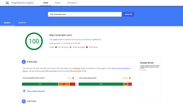
PageSpeed Insights
It analyzes your site’s loading speed and offers suggestions for improvement. Page speed is a critical factor in mobile-friendliness and SEO, so optimizing it is essential.
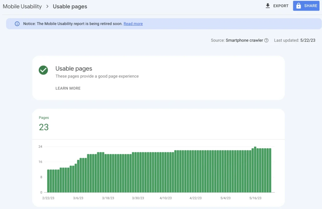
Mobile Usability Report:
Found in Google Search Console, it highlights mobile usability issues on your site. This report helps you identify specific mobile-related problems that need attention.
Conclusion
In the realm of web design and development, creating a mobile-friendly website is no longer a choice—it’s a requirement for maintaining online visibility and providing an excellent user experience. By implementing these best practices, guided by Koloursyncc‘s expertise, you can ensure that your website thrives in the mobile-centric digital landscape of 2023.
Mobile-friendliness not only pleases users but also keeps search engines on your side, ultimately leading to improved traffic, engagement, and success. With Koloursyncc by your side, your digital presence is optimized for maximum impact.