Introduction to responsive design
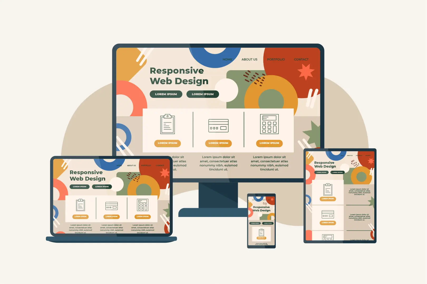
In today’s digital age, where a significant portion of internet traffic comes from mobile devices, having a responsive website is not just a luxury; it’s a necessity. Responsive web design ensures that your website adapts seamlessly to various screen sizes and devices, providing an optimal user experience. Let’s delve deeper into the world of responsive design and explore its significance in modern web development.
The significance of mobile optimization
With the proliferation of smartphones and tablets, the way people access the internet has undergone a dramatic shift. Mobile devices have become the go-to choice for browsing, shopping, and accessing information. A non-responsive website can lead to frustrated users and high bounce rates. Mobile optimization is no longer an option—it’s a critical component of web development.
The core principles of responsive design
Responsive design relies on a few core principles to ensure that your website functions well across different devices:
- Fluid grid layout: Instead of fixed pixel widths, responsive design uses relative units like percentages to create flexible grid layouts. This fluidity allows your website to adapt gracefully to screens of various sizes, from smartphones to desktop monitors.
- Media queries: CSS media queries are a powerful tool that allows you to apply different styles based on the device’s characteristics, such as screen size and orientation. By using media queries, your website can automatically adjust its layout and appearance to suit the user’s device, providing an optimized viewing experience.
- Flexible images and media: Images and media elements should also adapt to screen sizes, preventing overflow or distortion. This means that your website’s images and videos should resize and reformat themselves to fit the screen they are displayed on, ensuring that visual content is always presented at its best.
Key benefits of responsive design
The advantages of responsive design are manifold, including:
- Improved user experience: Responsive websites offer an improved user experience across all devices. Users can access your site on any device without compromising usability. Whether they’re using a smartphone, tablet, or desktop computer, they can easily navigate and interact with your content.
- Higher SEO rankings: Search engines like Google favor mobile-friendly websites. Websites that are responsive and provide a seamless experience on mobile devices tend to receive better search rankings. In other words, investing in responsive design can positively impact your website’s visibility and discoverability.
- Cost-efficiency: Instead of maintaining separate websites for mobile and desktop users, responsive design streamlines development and maintenance. This not only saves you time but also reduces costs associated with managing multiple versions of your site. A single responsive website can serve the needs of all users.
“The power of a website lies in its ability to connect people, information, and ideas. Responsive design ensures that this connection is seamless and universal.”
Implementing responsive design in web development
To implement responsive design effectively, follow these steps:
- Mobile-first approach: Start designing for mobile devices and then progressively enhance for larger screens. This approach ensures that your website’s core functionality and content are prioritized for mobile users, providing a solid foundation for responsive design.
- Use a framework: Frameworks like Bootstrap and Foundation offer pre-built responsive components and layouts. These frameworks can significantly expedite the development process and help ensure consistency in your responsive design.
- Testing: Regularly test your website on various devices and browsers to ensure consistent performance.
Testing and optimization
Testing is a crucial part of responsive design. Ensure that:
- Load times are fast: Optimize images and scripts to reduce load times. Fast-loading websites are essential for providing a smooth user experience, particularly on mobile devices with varying connection speeds.
- Content is readable: Check that text and images are legible on all screen sizes. Font sizes and image scaling should adapt to different screens to ensure that content remains readable and visually appealing.
- Functionality is consistent: Test all interactive elements to ensure they work as intended. Buttons, forms, and navigation menus should function seamlessly, regardless of the user’s device.
Challenges and common mistakes to avoid
While responsive design offers numerous benefits, it comes with its own set of challenges and potential pitfalls. Avoid these common mistakes:
- Overloading with features: Don’t overload your mobile site with unnecessary features that slow down performance. Prioritize essential functionality and content to maintain a responsive and fast-loading experience.
- Ignoring performance: Pay attention to performance optimization, as slow-loading sites can deter users. Minimize unnecessary scripts and optimize assets to ensure speedy page load times.
- Not prioritizing content: ensure that essential content is visible and accessible on smaller screens. Avoid hiding critical information or making users scroll excessively to find what they need.
Conclusion
In conclusion, responsive design isn’t just a feature; it’s the heartbeat of modern web development. It’s the bridge that connects your brand with the digital world, ensuring a seamless user experience across all devices. As you embark on your journey to create a website that captivates, informs, and engages, consider Koloursyncc as your trusted partner. With our expertise and dedication, we can help you build not just a website, but a digital masterpiece that shines on every screen, leaving a lasting impression on your audience.
Join hands with Koloursyncc today, and let’s redefine web excellence together. Your website’s success story begins here.